

Payment Analytics
Read revenue metrics, trends, and breakdowns by gateway, type, and currency, and generate an AI summary of your workspace's payment performance.
Payment Analytics
Payment Analytics is the reporting view for everything your workspace earns. It rolls up transactions into headline revenue metrics, a revenue-over-time chart, and breakdowns by payment gateway, purchase type, and currency, plus a ranked list of your best-selling courses. Admins and finance owners use it to track how revenue is trending, where it comes from, and which products sell — and can generate an on-demand AI summary of the current numbers.
Opening Payment Analytics
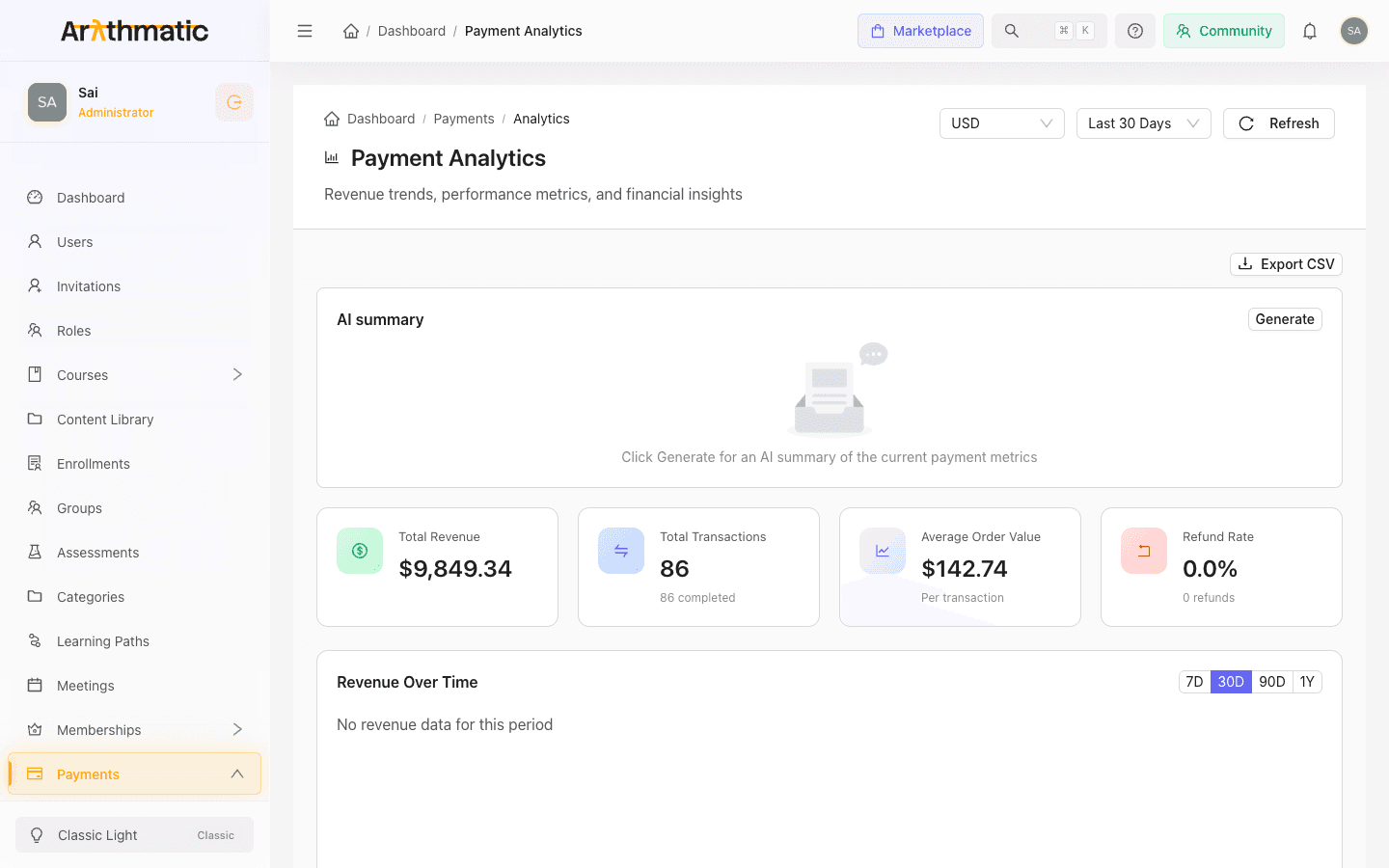
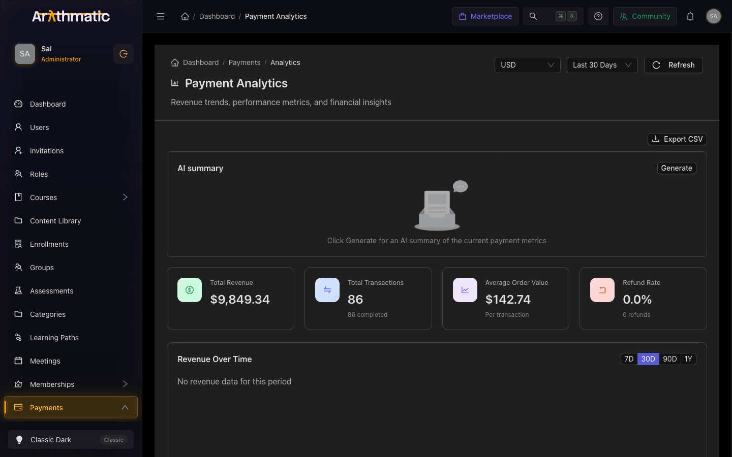
Go to Payments in the manage dashboard, then open Analytics (the page breadcrumb reads Dashboard / Payments / Analytics). The title bar shows Payment Analytics with the subtitle Revenue trends, performance metrics, and financial insights.
Page controls
Three controls sit in the top-right of the page header and apply to the whole screen:
| Control | What it does |
|---|---|
| Currency | Selects the currency all monetary values are displayed in. Amounts are converted from your workspace's primary currency using live exchange rates. Your choice is remembered the next time you open the page. |
| Period | Sets the reporting window: Last 7 Days, Last 30 Days, Last 90 Days, or Last Year. Defaults to Last 30 Days. |
| Refresh | Reloads all metrics and charts with the latest data. |
The Currency selector only changes how amounts are displayed — it converts the same underlying revenue into the currency you pick. It does not filter to transactions made in that currency. Use the Revenue by Currency card below to see what learners actually paid in each currency.
Revenue metric tiles
Four tiles across the top summarize the selected period:
| Tile | What it shows |
|---|---|
| Total Revenue | Total revenue for the period, with a green up-arrow or red down-arrow showing the percentage change versus the previous comparable period. |
| Total Transactions | The count of all transactions, with a subtext showing how many completed. |
| Average Order Value | Revenue divided by transactions — the typical amount per transaction. |
| Refund Rate | The share of transactions refunded, shown as a percentage, with the total number of refunds underneath. |
Read the tiles together. A rising Total Revenue with a climbing Refund Rate may mean you are selling more but also refunding more — worth investigating before you celebrate the top-line number.
AI summary
The AI summary card sits above the metric tiles. It is not generated automatically — click Generate to have Arythmatic analyze the current period's numbers and return a short headline, a list of Key insights, and (when relevant) Risks and Recommendations. Once generated you can click Regenerate to produce a fresh take; a cached tag appears when the summary was served from a recent cached result rather than recomputed.
The summary is built from the metrics currently on screen — the selected period, currency, revenue, transactions, refunds, and the gateway, type, and currency breakdowns — so generate it after you have set the period and currency you want to analyze.
Reading the charts
Revenue Over Time
A trend chart of revenue across the period, drawn as a series of bars. It has its own 7D / 30D / 90D / 1Y toggle so you can change the trend window independently of the page-level Period control. Hover any bar to see the exact date and amount. Granularity adjusts automatically: 7-day and 30-day views plot daily points, while 90-day and 1-year views plot monthly points. If there is no revenue in the window, the chart shows No revenue data for this period.
Revenue by Gateway
A donut chart splitting revenue across your payment gateways (for example Stripe or Razorpay), with the combined Total in the center. The legend lists each gateway with its revenue amount and percentage share, so you can see which processor handles most of your volume.
Revenue by Type
Horizontal bars comparing revenue by what was purchased — Course Purchases, Learning Path Purchases, and Membership Purchases. Each bar shows the revenue total and the number of purchases beneath it, making it easy to see whether one-off course sales or recurring memberships drive your revenue.
Revenue by Currency
Lists each currency learners actually paid in. Each row shows the currency code, the native amount paid in that currency, the transaction count, and an approximate value converted into your selected display currency (marked with ≈). A share bar visualizes each currency's proportion of total converted revenue. This card is the source of truth for real per-currency intake, independent of the display-currency selector.
Top Courses
A ranked list of your best-selling courses. The heading switches based on available data: it reads Top Courses by Revenue when per-course revenue is attributed to transactions, and falls back to Top Courses by Enrollment otherwise. Each row shows the rank, course name, a type tag, and either revenue with a sales count or an enrollment count.
If the top list shows Top Courses by Enrollment instead of revenue, your transactions are not yet attributing revenue to individual courses. The ranking is still useful, but the amounts reflect enrollments rather than money earned.
Exporting the data
Click Export CSV (top-right of the analytics area) to download the current view as a CSV. The file includes the summary metrics block plus the by-currency, by-gateway, and by-type breakdowns for the selected period and currency. The button is disabled until the data has loaded. Use the export to reconcile against your gateway payouts or to build custom reports in a spreadsheet.
Related
- Course Pricing — set the prices that feed these revenue numbers
- Learning Path Pricing — bundle pricing that appears under Learning Path Purchases
- Memberships — recurring revenue shown under Membership Purchases
- Payments Overview — transaction history and gateway configuration
Payment Intents
Monitor incomplete payment attempts, diagnose failed or pending checkouts, and cancel stuck intents from the Payment Intents screen.
Coupons & Discount Codes
Create and manage percentage or fixed-amount discount codes with validity windows, usage limits, and course or learning path targeting.
