

Theme Editor
Design your workspace theme with brand, background, and text colors, typography, and a live device preview, then save and activate it.
Theme Editor
The Theme Editor controls the look of your learner-facing site: brand accent colors, page backgrounds, text colors, and typography. You edit light and dark variants side by side, watch every change render instantly in a device preview, then save and activate the theme so learners see it. Themes are versioned, so previous designs stay as inactive historical records you can return to.
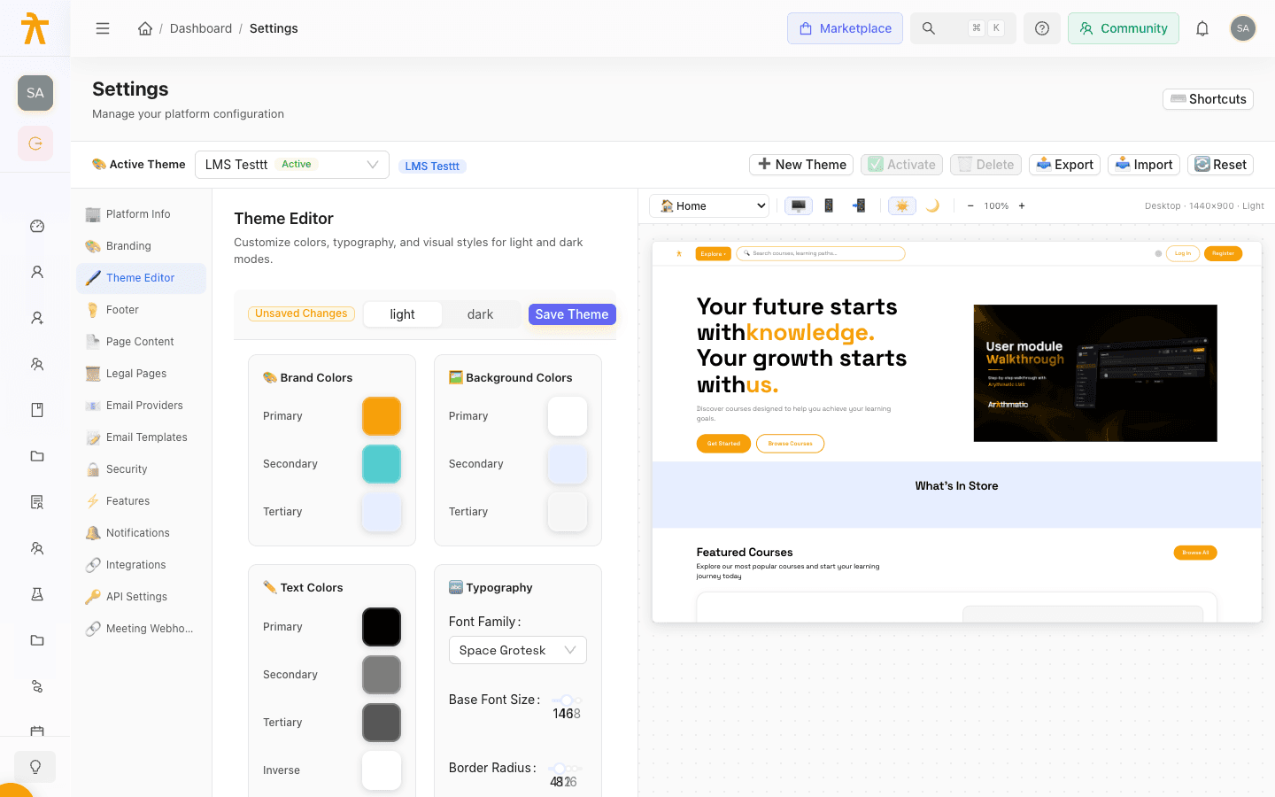
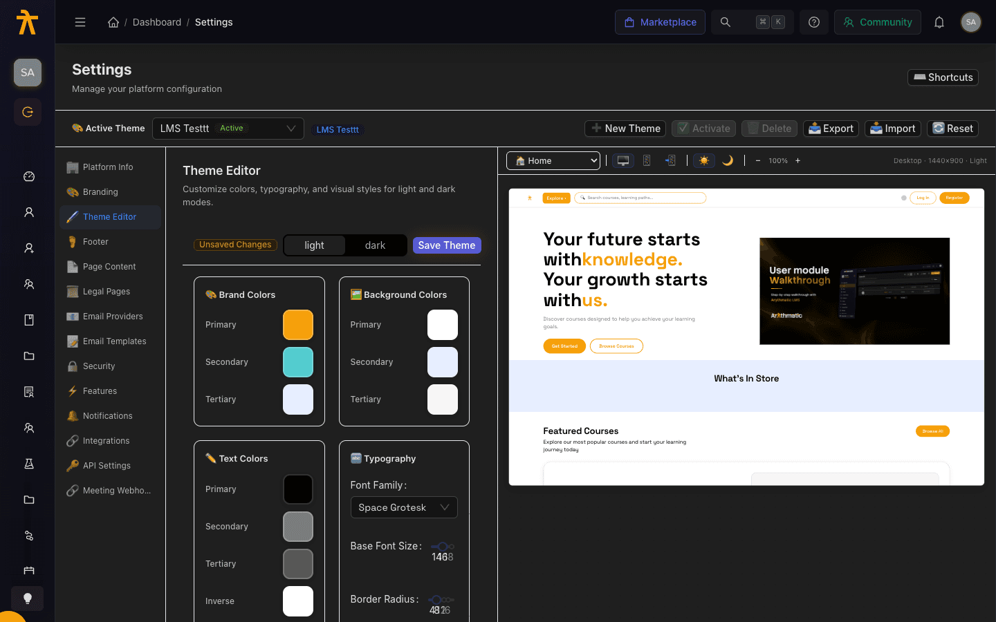
Open the Theme Editor
- Go to Settings and open the Theme Editor section.
- Use the Active Theme bar at the top to pick which saved theme you are working on. The theme currently live for learners is marked with a green Active tag.
- To create a new theme, select New Theme. It starts from the built-in default values — a fully populated theme, not a blank canvas — and leaves your current theme active until you Activate the new one. To restore the built-in default, use Reset, which deactivates all themes and creates a fresh default while keeping older themes as inactive records.
Reset does more than reset colors. A theme is a single record that also holds your logos, favicon, footer, legal pages (Terms, Privacy, Refund), and landing-page content. Resetting deactivates every existing theme and activates a brand-new default that has none of that content — so learners immediately see the built-in default logos, an empty/default footer, default landing copy, and default legal pages. Your old content survives only as an inactive historical theme you would have to reactivate to restore. Don't use Reset just to fix a color mistake.
Edit light and dark variants
At the top of the editor, the light / dark segmented control switches which variant you are editing. Each variant stores its own full set of colors, so switch modes and adjust both — learners who use dark mode see the dark variant. An Unsaved Changes tag appears whenever the current theme has edits you have not yet saved.
Set colors
Colors are grouped into three sections, each with its own row of swatches:
| Section | What it controls |
|---|---|
| Brand Colors | Primary accent colors used for buttons, links, and highlights. |
| Background Colors | Page and surface backgrounds. |
| Text Colors | Heading and body text colors. |
To change a color:
- Click the swatch for the value you want to edit. The color picker opens.
- Choose a color using the slider, wheel, or input tab. The input tab accepts HEX, RGB, or HSL values, and the eyedropper button lets you sample any color on screen.
- Pick a Preset swatch for a quick common color, or click the original swatch to reset.
- Select Apply to commit the color, or Cancel to discard it.
The picker shows an Original versus Modified comparison and a small dirty indicator on the swatch, so you can always see what changed before you apply it.
Set typography
The Typography section controls the type and shape of your interface:
| Control | Options |
|---|---|
| Font Family | A searchable list including System Default, Inter, Roboto, Open Sans, Lato, Montserrat, Poppins, Nunito, Raleway, Source Sans Pro, DM Sans, Plus Jakarta Sans, and Space Grotesk. |
| Base Font Size | A slider from 12 to 20 pixels that drives the live preview. |
| Border Radius | A slider from 0 to 24 pixels that rounds corners in the live preview. |
Only the Font Family is saved and applied to learners today. Base Font Size and Border Radius currently affect the admin-side live preview only — they are not yet persisted, so both reset to their defaults (16 px and 8 px) after you save or reload, and do not change what learners see. The saved Font Family applies to both the light and dark variants.
Because Base Font Size and Border Radius are not saved yet, use them to explore a look in the preview, but don't rely on them to change the live interface for learners.
Preview your changes
Every edit updates the live preview on the right in real time. Use the preview toolbar to check your design across contexts:
- The page selector switches between sample pages such as Home, Courses, Dashboard, and Login.
- The device buttons switch between desktop, tablet, and mobile frames, with a model sub-selector for mobile.
- The light / dark toggle previews either variant, and the zoom control scales the frame.
Preview the Login and Home pages in both light and dark mode before saving — those are the first screens most learners see, and low-contrast text or background choices show up there first.
Save and activate
- When your design looks right, select Save Theme in the editor header. Save is only enabled while there are unsaved changes.
- Saving stores the theme but does not make it live. To publish it to learners, return to the Active Theme bar and select Activate.
- The activated theme becomes the live design; the Active tag moves to it.
A theme bundles every branding surface, not just colors: logos and favicon, typography, the footer, your legal pages (Terms, Privacy, Refund), and all landing-page content are stored together on the one theme record. Activating a different theme swaps all of them at once. If you built your footer, legal text, and landing copy under one theme and then activate an older or alternate theme to change colors, learners silently revert to whatever that theme stored for those surfaces — including legally sensitive Terms/Privacy/Refund pages.
Activating replaces the live theme for everyone immediately. You cannot delete the currently active theme — activate a different one first, then delete. Use Export to download a theme as JSON before large changes so you can Import it back if needed.
